Bringing generosity back to Cadbury through a global rebrand
With a grounding in goodness since 1824, John Cadbury’s company has always championed community. But the brand had started to lose its connection with consumers. Our challenge was to disrupt the trend and shift the focus from joy to generosity, driving brand love and desire on a global scale, while showcasing the chocolate’s high-quality credentials.
project
Cadbury Global Rebrand
client
Mondelēz International
Services
Innovation
Brand Identity System
Brand Architecture
Packaging Design
Digital Design
Motion Design
Brand Film & Photography
3D Environments
Brand Campaigns
Limited Editions
Collaboration
COLLABORATORS

The mark
of the maker
_1.2.avif)
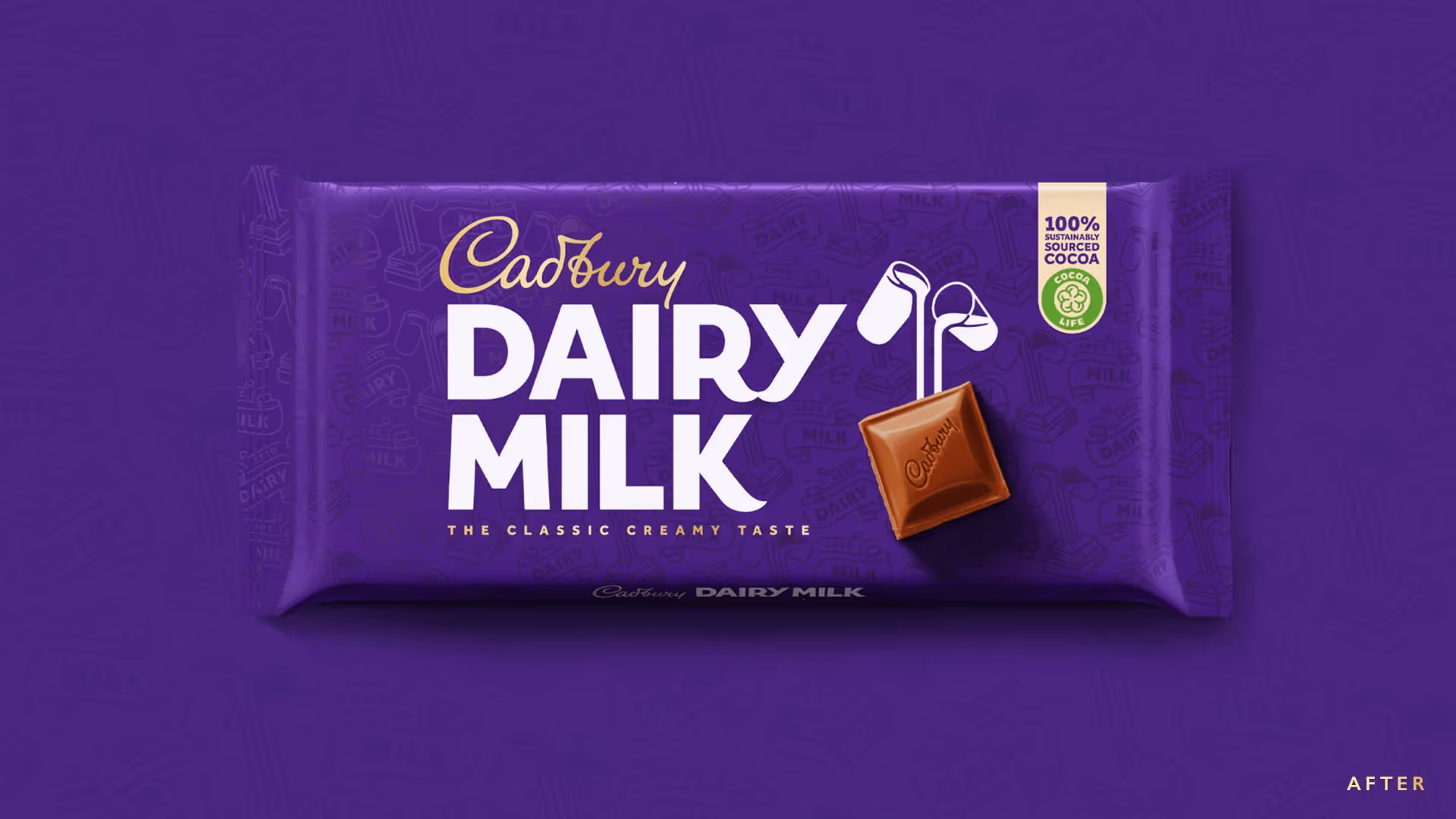
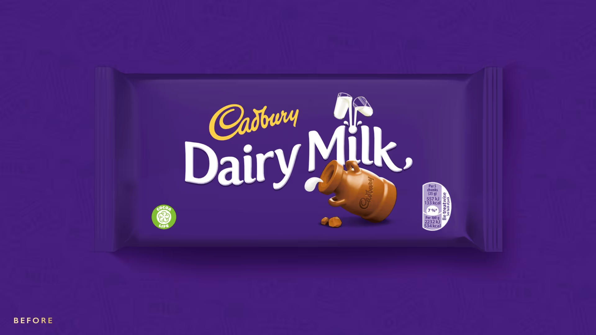
Cadbury’s belief in giving back inspired our core idea of 'Generous Spirit': a purpose-driven strategy that shifted the brand from a world of artificial joy to a reflection of the goodness within us all. We brought humanity back to the iconic word mark, making it clear that it came from the hand of John Cadbury himself, and refined the Dairy Milk typography to capture the pride and warmth at the brand’s heart.
Generous
spirit
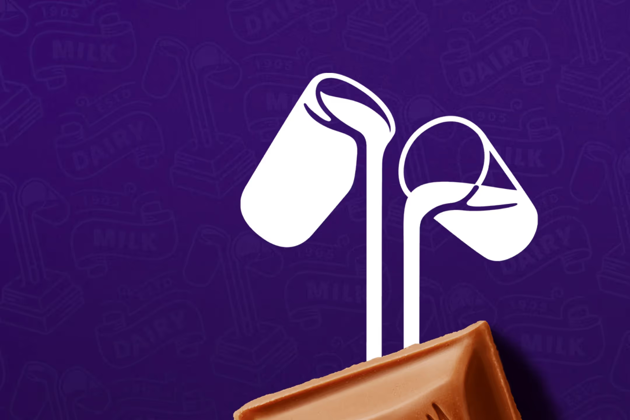
The Glass-and-a-Half logo was reborn, placing the famous Cadbury chunk back at the brand's core. The elegant, simple logo now directly pours into the chunk, creating the centrepiece of the new brand and acting as shorthand for the spirit of generosity.
_1.1.avif)
_1.2.avif)
_1.4.avif)
_1.3.avif)
_1.1.avif)


Sweet
success
With 5.7% sales increase YOY, 10.4% revenue growth in 2021 and a 5% improvement in Brand Power perception, the new brand has been a global success. As well as retaking its rightful place as a true global icon, Cadbury has disrupted the chocolate market to become the category’s #1 most meaningful brand.
Growth
5.7%+
5.7%+ sales YOY, 10.4%+ chocolate revenue growth in 2021.
Standout
5%+
5% improvement in ‘brand power’. ‘Cadbury purple’ is now trademark protected.
Fandom
No. 1
No. 1 most meaningful brand in the category.
No. 1 most-Googled in 78 countries.
No items found.
No items found.
Next Up...


scrolL to QUICK jump